Join the revolution!Let's create a new caring economy.
Client
DALYA
Industry
Crypto
Blockchain
Services
Brand Strategy
Visual Identity

Background
DALYA, a Decentralised Autonomous Organisation (DAO), aims to revolutionise drug development for neglected diseases. To convey immediacy, innovation, and community empowerment, DALYA sought a brand identity and strategy that resonated with the tech-savvy crypto community as well as the scientific and public health sectors.
Brand Strategy
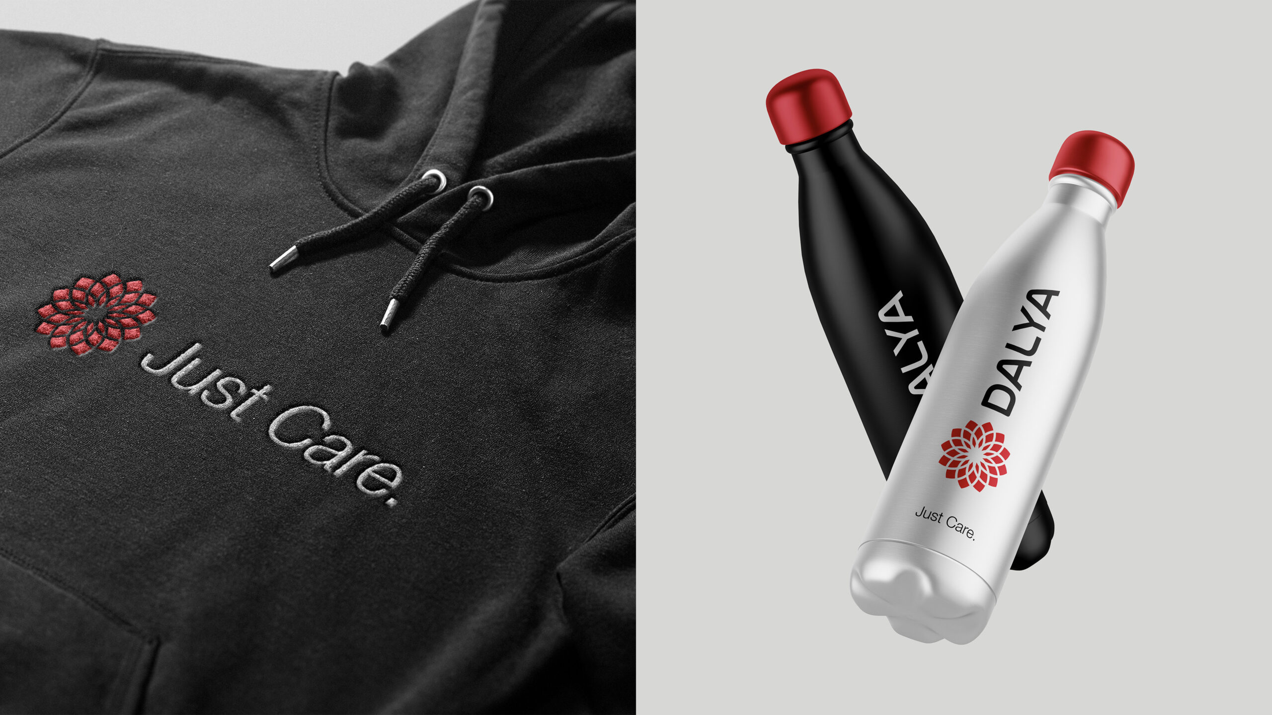
Inspired by the resilient Dahlia flower, the DALYA mark symbolises symmetry and interconnectedness. The logo’s dynamic, fragmented petals represent the urgent, fragmented global health system. This visual metaphor mirrors DALYA’s mission to bring cohesion and impactful change to neglected disease treatment, like the Dahlia’s ability to thrive in diverse environments.
Visual Identity
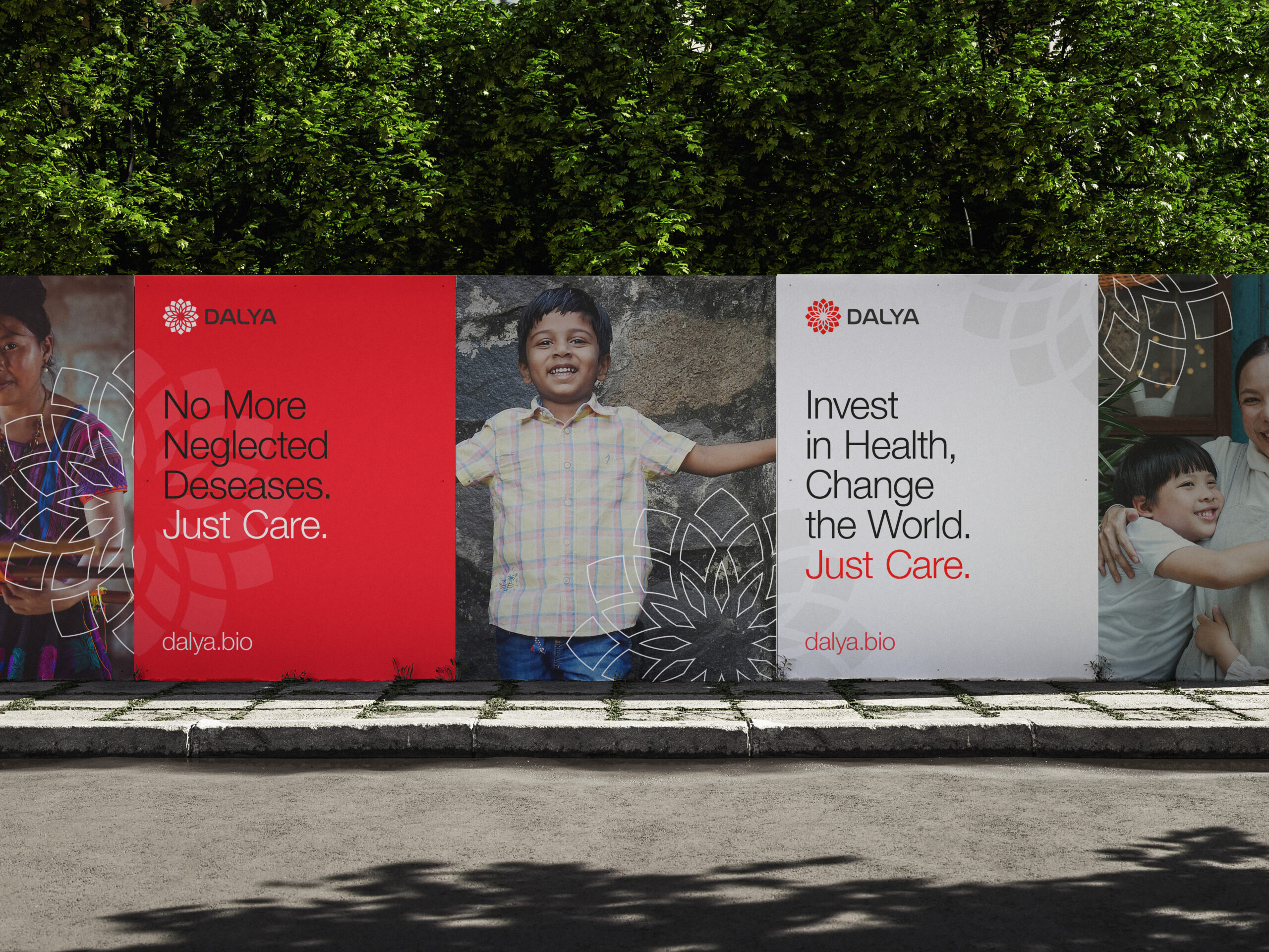
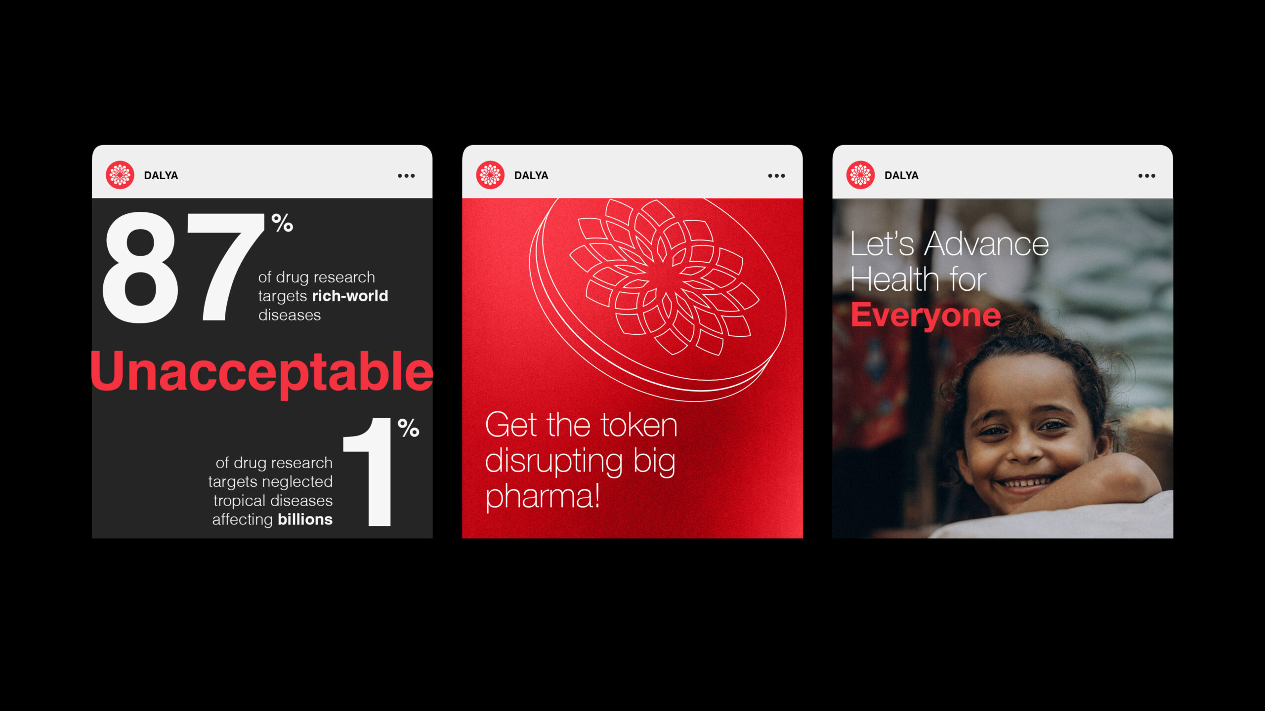
DALYA’s brand identity reinforces its purpose and values through urgent red, conveying immediacy, passion, and emphasising action. The confident sans serif font conveys determination and modern innovation, connecting with crypto-natives.